Introducing flexdashboard
Introduction
Dashboards are great tools for grouping common visualizations together into one page or site. This allows the user to consume large amounts of visualizations in a quick and easy method.
Example Dashboard
A search for dashboard on Google will result in millions of results. To show you a real life example, I have built a simple dashboard showing some basic statistics of my golf game over the last few years. The complete dataset can be found on my website. There are other examples that are far better, but one that I have started on using data gathered by myself.
Flexdashboard
Flexdashboard is another R package that will create dashboards for you using your own plots from ggplot (or any other graphing package). The benefit of this package is that all the nitty gritty details of having to make columns and making it responsive for the web or mobile devices is taken care of. All you have to worry about is gathering the data and building the visualizations you want to include.
Basic Example
As usual, we need to import our libraries and gather our data. For this example, we will just look at the home run and strikeout numbers from Babe Ruth’s career.
#import libraries
library(Lahman)
library(dplyr)
library(ggplot2)

#store data into a variable named df
result<-Batting %>%
  filter(playerID=='ruthba01') %>%
  select(yearID, SO, HR)
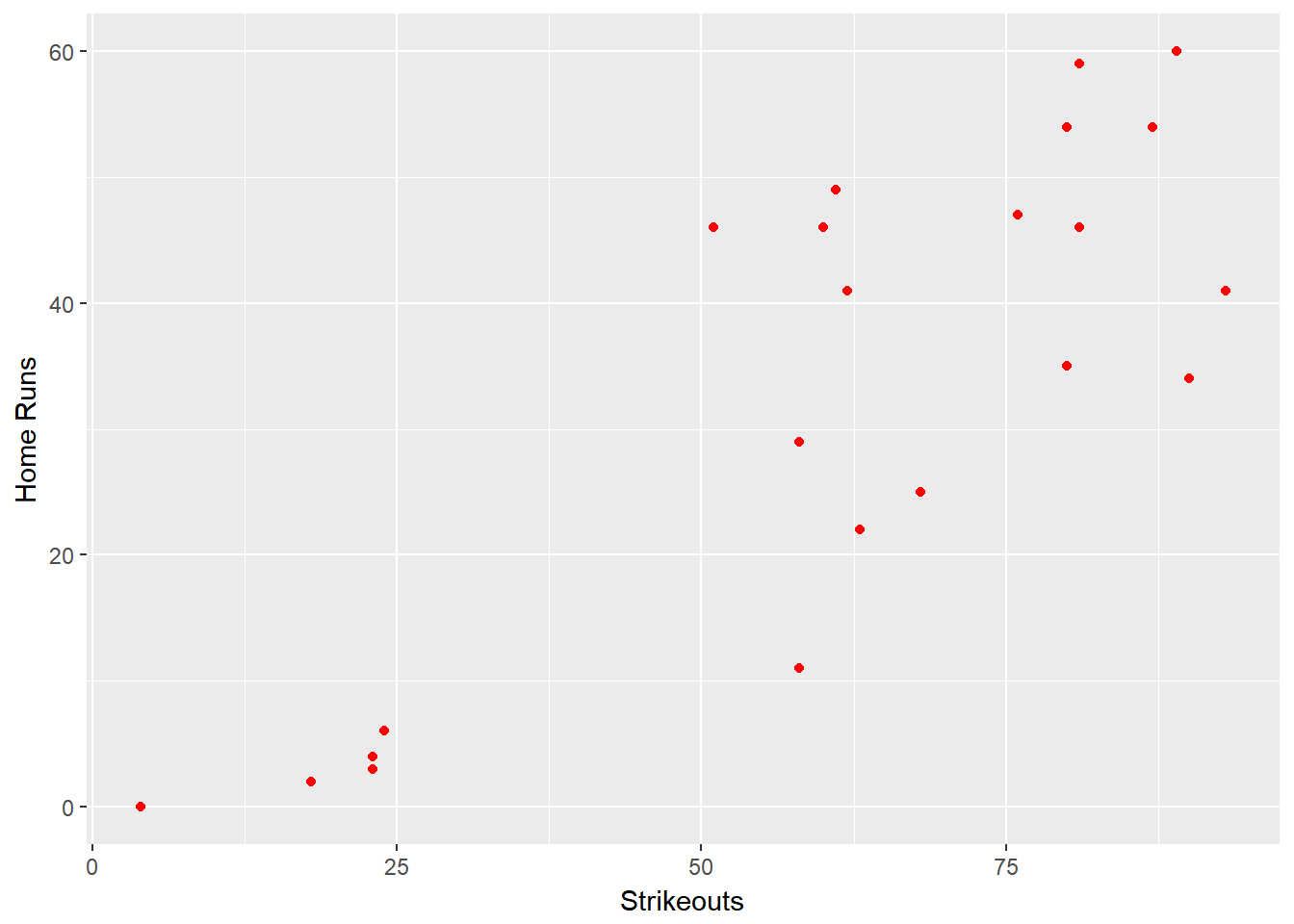
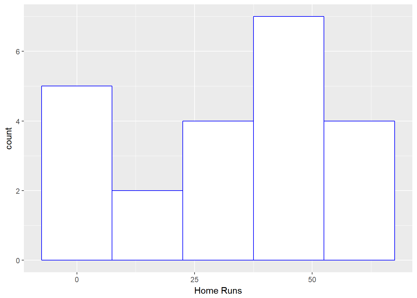
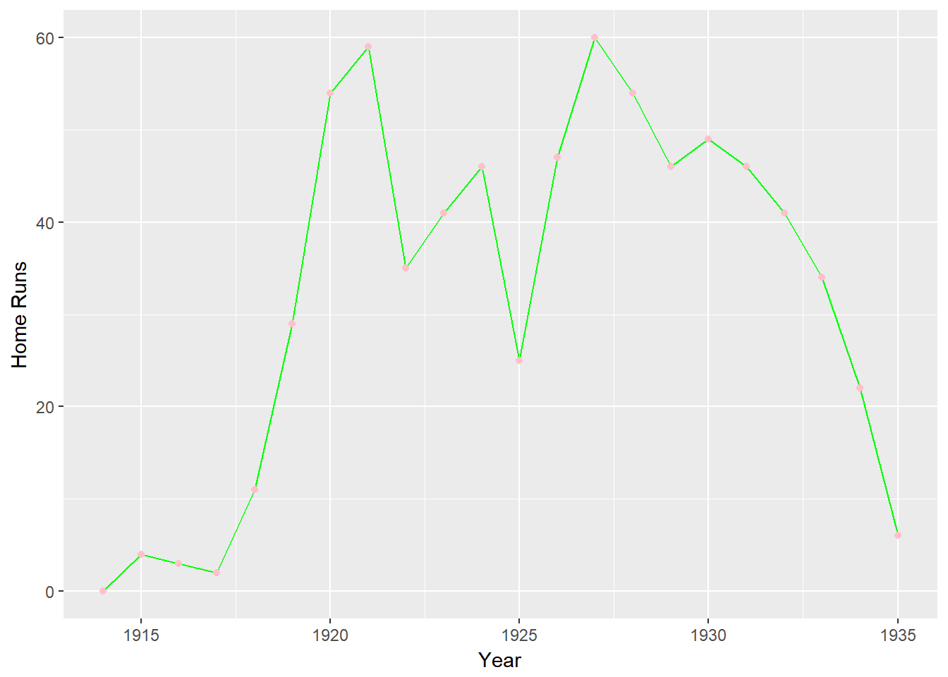
Once we have that data we can focus on building our visualizations. We will be including the following three in our dashboard.
#scatterplot
ggplot()+
  geom_point(data=result,aes(x=SO,y=HR),color="red")+
  xlab("Strikeouts")+
  ylab("Home Runs")
#histogram
ggplot()+
  geom_histogram(data=result,aes(x=HR),color="blue",fill="white",bins=5)+
  xlab("Home Runs")
#timeseries
ggplot()+
  geom_line(data=result,aes(x=yearID,y=HR),stat="identity",color="green")+
  geom_point(data=result,aes(x=yearID,y=HR),stat="identity",color="pink")+
  xlab("Year")+
  ylab("Home Runs")
Once we have these ready we can build our dashboard. Dashboards are not suited for a blog post, so all the code for this example can be found on GitHub, and the resulting dashboard can be viewed here.
Advanced Example
I decided to try and make a dashboard using data that I collected myself when I play golf. Using the same database as the first example linked out (a Microsoft SQL Server database), I created three simple graphs and combined them into the start of a basic dashboard. The database connection information has been removed from the code in GitHub, but the remaining R script and Rmd dashboard file are included.