Using ggplot - Histograms
Introduction
A histogram uses rectangular bars to represent data that is grouped into a series, sized accordingly based on the numerical value associated with it. The rectangular bars can be displayed either vertically or horizontally.
Basic Example
First, we must gather our data. Here we are using the Lahman database and obtaining all of the weights of baseball players throughout the years.
#import libraries
library(Lahman)
library(dplyr)
library(ggplot2)

#store data into a variable named df
df<-Master %>%
  filter(!is.na(weight)) %>%
  select(weight)
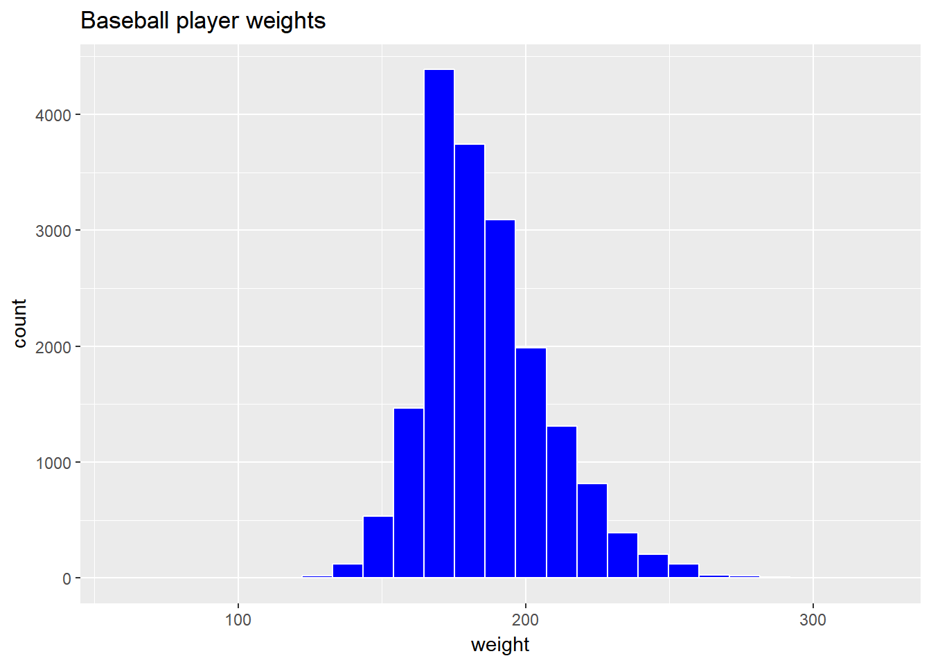
To display the chart, we use the ggplot library. The ‘data’ parameter is the data source, and ‘aes’ refers to the aesthetics.
ggplot()+
  geom_histogram(data=df,aes(x=weight), color="white", fill="blue", bins=25)+
  ggtitle("Baseball player weights")