Using ggplot - Introduction to facet_wrap
Introduction
In our last post “Simple Sentiment Analysis”, we learned how to categorize the sentiment of a novel, and plot the positive/negative trend into one plot. In this post, we will look at a function called facet_wrap, which will allow us plot both the negative and positive sentiments on two different plots, side-by-side.
Gathering our Data
We will continue to analyze the novel “Dracula”, just like in the last post, splitting apart the lines of text into words and counting the occurrence of each. In this example, however, we won’t need to group the lines of text, since we only want the words. Later on, we will be creating a bar chart of the top 10 positive words, and the top 10 negative words.
First, we import our libraries as usual, and download the text using the gutenbergr package. Once we have done that, we split apart the lines of text using unnest_tokens. Finally, using the Bing sentiment from tidytext, we will join the words in each together.
library(gutenbergr)
library(tidytext)
library(dplyr)
library(ggplot2)

dracula<-gutenberg_download(345)

dracula<-dracula%>%
  unnest_tokens(word, text)

bing<-get_sentiments('bing')
dracula<-inner_join(dracula, bing)
Next, we use dplyr to group and filter the words, and only pull back the top 10 for each sentiment. We create two new dataframes, one for positive words, and one for negative words. The top_n() function allows us to select only the number of records we want, but we also must pass in the wt parameter, which is the variable that we want to use for ordering, which for us, is the count.
A new parameter was added to the summarize() function. Normally when using group_by() and summarize() we get just the field we grouped by and the summary column. We can also add the sentiment column to this by using the first() function to grab the first value of the column passed in. We already filtered the sentiment to our liking, so we know this new column will contain the proper sentiment.
words_pos<-dracula%>%
  filter(sentiment=='positive')%>%
  group_by(word)%>%
  summarize(count=n(), sentiment=first(sentiment))%>%
  arrange(count)%>%
  top_n(10, wt=count)

words_neg<-dracula%>%
  filter(sentiment=='negative')%>%
  group_by(word)%>%
  summarize(count=n(), sentiment=first(sentiment))%>%
  arrange(count)%>%
  top_n(10, wt=count)
Finally, we need to convert the word column to a factor, so the plot will be ordered properly. Once we have our positive and negative dataframes set, we use the rbind() function to row bind (or “join”) the two together into one. This new dataframe will contain 20 rows with 3 columns.
words_pos$word<-factor(words_pos$word, levels=words_pos$word)
words_neg$word<-factor(words_neg$word, levels=words_neg$word)

# The new data frame with the top 10 positive and top 10 negative words
words<-rbind(words_pos, words_neg)

print(words, n=20)
## # A tibble: 20 x 3
## word count sentiment
## <fctr> <int> <chr>
## 1 sweet 66 positive
## 2 ready 71 positive
## 3 better 77 positive
## 4 love 84 positive
## 5 right 99 positive
## 6 work 146 positive
## 7 great 183 positive
## 8 well 245 positive
## 9 good 258 positive
## 10 like 292 positive
## 11 trouble 53 negative
## 12 fell 59 negative
## 13 miss 60 negative
## 14 dark 77 negative
## 15 strange 90 negative
## 16 death 94 negative
## 17 terrible 100 negative
## 18 dead 109 negative
## 19 fear 137 negative
## 20 poor 193 negativeCreating the Plot
We start off creating our bar plot, just as we learned in a previous post. However, this time, we will use the facet_wrap() function to split apart the sentiment into separate plots. Using the ~ character, we specify which column will be used as our grouping, in this case the sentiment column.
To display the plots equally, side by side, we use the scales=“free_y” argument.
ggplot()+
  geom_bar(data=words, aes(x=word, y=count), stat="identity")+
  xlab("Word")+
  ylab("Count")+
  coord_flip()+
  ggtitle("Top 10 Positive/Negative Words in Dracula")+
  facet_wrap(~sentiment, scales='free_y')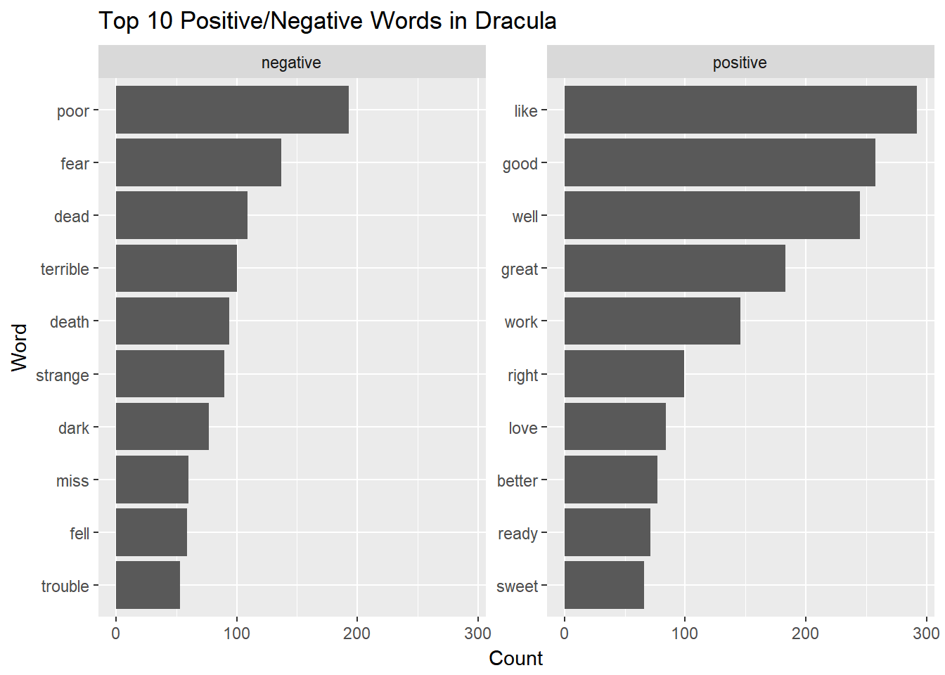
By default, ggplot determines the colors for each plot. In the spirit of Halloween and the text we are analyzing, let’s change the positive words to be orange (with a black outline), and the negative words to be black (with an orange outline). To do so, we have to update the aesthetics with which column we are grouping on (again, the sentiment column). We manually set the colors using the scale_fill_manual and scale_color_manual() functions by passing in a vector of the colors to use.
ggplot()+
  geom_bar(data=words, aes(x=word, y=count, fill=sentiment, color=sentiment), stat="identity")+
  xlab("Word")+
  ylab("Count")+
  coord_flip()+
  ggtitle("Top 10 Positive/Negative Words in Dracula")+
  facet_wrap(~sentiment, scales='free_y')+
  scale_fill_manual(values=c('#000000', '#ea6205'))+
  scale_color_manual(values=c('#ea6205', '#000000'))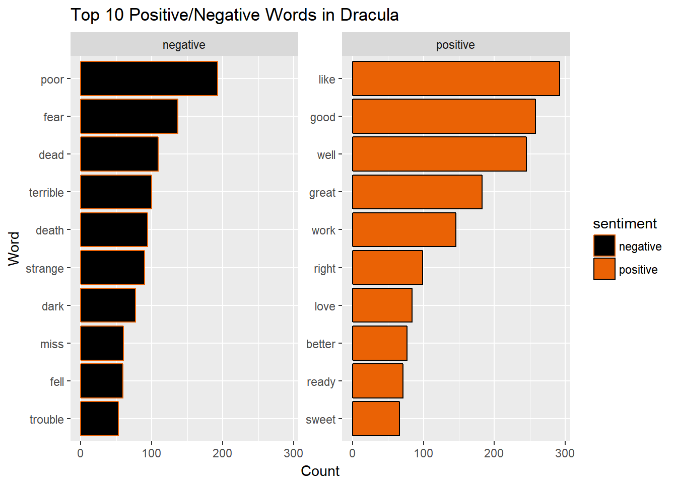
The Code
The code for this post can be found on my GitHub Gists page.