Using ggplot - Scatterplots
Introduction
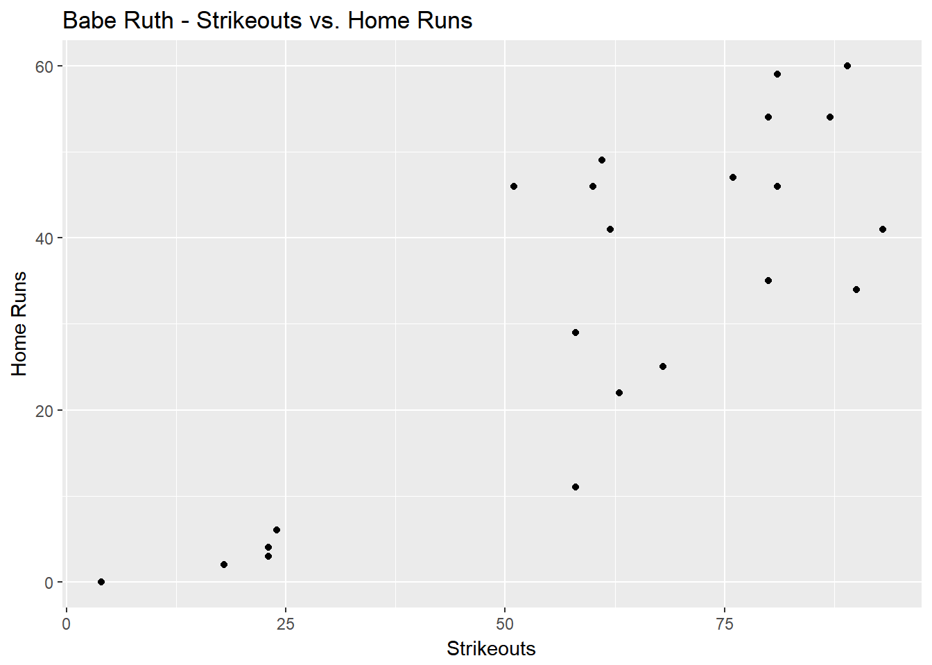
A scatterplot is a useful visualization that compares two series of numbers against each other. This can be great for determining a correlation between the series. In our example below, we will compare Babe Ruth’s career home runs against his career strikeouts to see if there is any relationship between how many home runs he hit and if that means more strike outs.
Basic Example
First we need to import our libraries and gather our basic data. Here we just need the home runs and strikeouts for each year.
#import libraries
library(Lahman)
library(dplyr)
library(ggplot2)

#store data into a variable named df
df<-Batting %>%
  filter(playerID=='ruthba01') %>%
  select(SO, HR)
Next up we need to use ggplot to create a scatterplot and define which number series is on which axis.
ggplot()+
  geom_point(data=df,aes(x=SO,y=HR))+
  xlab("Strikeouts")+
  ylab("Home Runs")+
  ggtitle("Babe Ruth - Strikeouts vs. Home Runs")
Advanced Example
Now we want to see if the correlation is the same for all great home run hitters in baseball history. Here we will need to expand our dataset as well as make our scatterplot interactive with ggiraph.
#import ggiraph library for interactivity
library(ggiraph)

#expand our dataset to include more players and detail
# Here we are getting all the players with 400 or more career home runs
df<-Batting%>%
  group_by(playerID)%>%
  summarize(career_hr=sum(HR),career_so=sum(SO))%>%
  filter(career_hr>=400)

#now join this summarized data with player names and information for readability
# joining the df results with the Master table into a new variable called hr_vs_so
hr_vs_so<-inner_join(df, Master, by=c("playerID")) %>%
  select(nameFirst, nameLast, career_hr, career_so)

#finally merge the first and last name fields into one column for easier access
hr_vs_so$name<-paste(hr_vs_so$nameFirst, hr_vs_so$nameLast)
Now we can plot the points and use the ggiraph library to make the points hoverable and interactive.
g<-ggplot()+
  geom_point_interactive(data=hr_vs_so,aes(x=career_so,y=career_hr,tooltip=name,data_id=nameLast))+
  ggtitle("Career HR vs. SO")+
  xlab("Career SO")+
  ylab("Career HR")

ggiraph(code=print(g),hover_css="fill:white;stroke=black")