Using ggplot - Time Series
Introduction
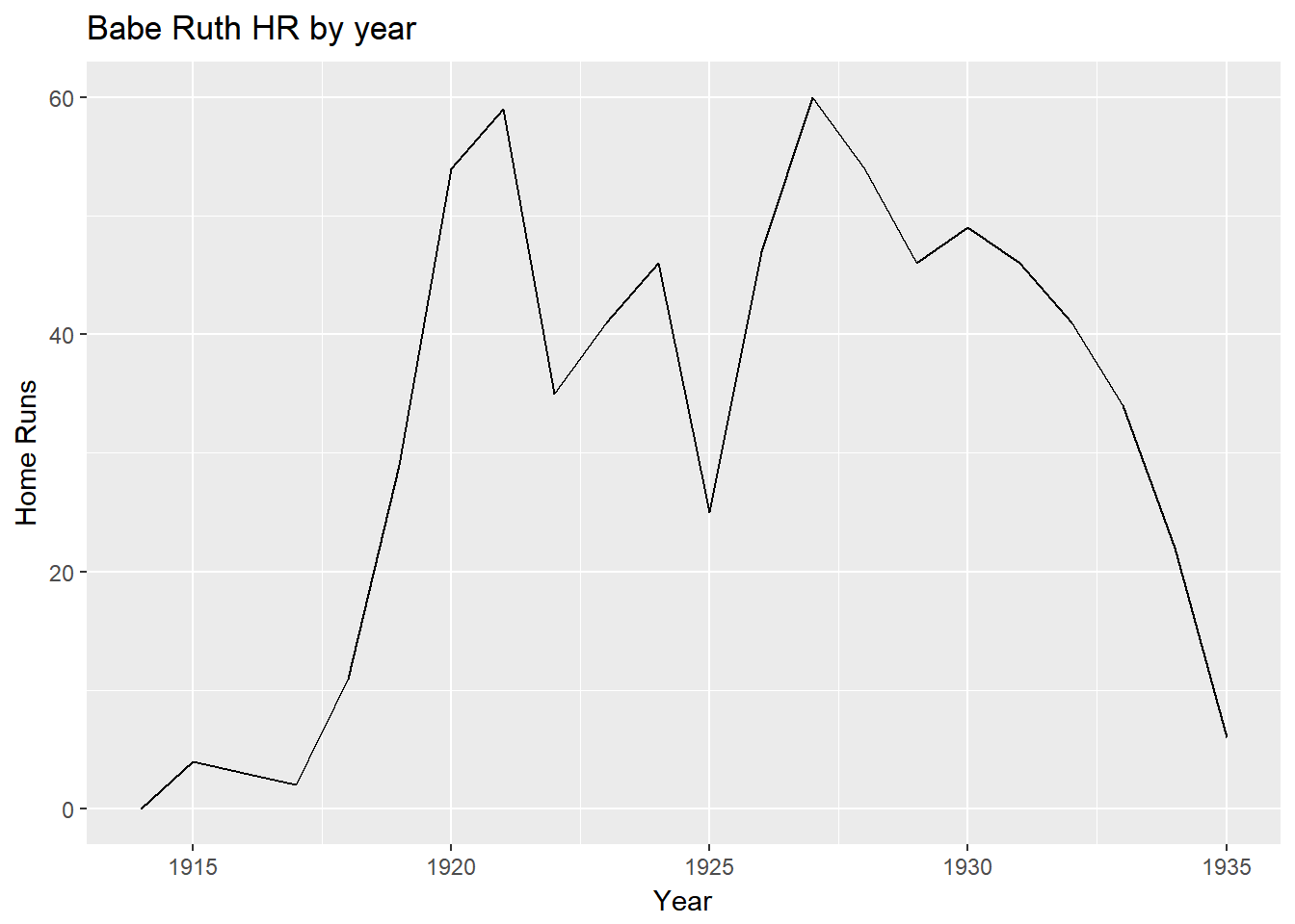
A new chart to introduce is called a time series. This type is used when you want to visualize data along a period of time. The x-axis represents the time and the y-axis represents the data. This is a subset of the line graph, as a line graph doesn’t have a precondition of the x-axis representing time.
Basic Example
For this example we will use the number of home runs that Babe Ruth during his career.
#import libraries
library(Lahman)
library(dplyr)
library(ggplot2)
library(ggiraph)

df<-Batting %>%
  filter(playerID=='ruthba01')%>%
  select(yearID, HR)

ggplot()+
  geom_line(data=df,aes(x=yearID,y=HR))+
  ggtitle("Babe Ruth HR by year")+
  xlab("Year")+
  ylab("Home Runs")
Adding Data Points
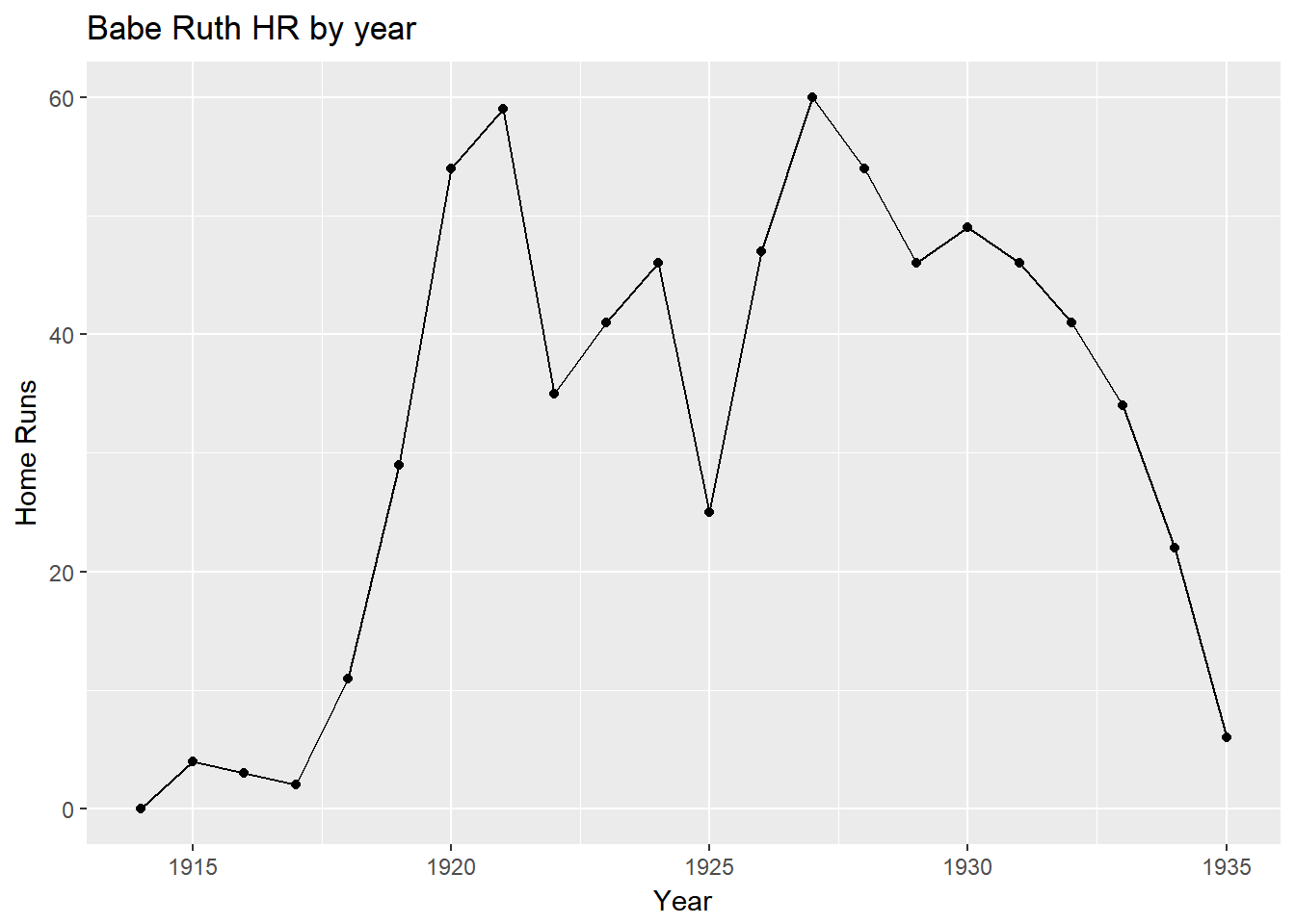
We can combine two types of charts into one. Here we want to display data points along with the line graph in order to make it simpler for the user to read.
ggplot()+
  geom_line(data=df,aes(x=yearID,y=HR))+
  geom_point(data=df,aes(x=yearID,y=HR))+
  ggtitle("Babe Ruth HR by year")+
  xlab("Year")+
  ylab("Home Runs")
Adding interactivity with ggiraph
g<-ggplot()+
  geom_line_interactive(data=df,aes(x=yearID,y=HR))+
  geom_point_interactive(data=df,aes(x=yearID,y=HR,tooltip=HR,data_id=yearID))+
  ggtitle("Babe Ruth HR by year")+
  xlab("Year")+
  ylab("Home Runs")

ggiraph(code=print(g),hover_css="fill:white;stroke:#336699")